La Margherita
For over 30 years, La Margherita has been a trusted home improvement, construction supply, and garden product merchant. In recent years, the business has experienced a rapid expansion, going from a single store to 14 outlets, effectively covering the length and breadth of the entire region.
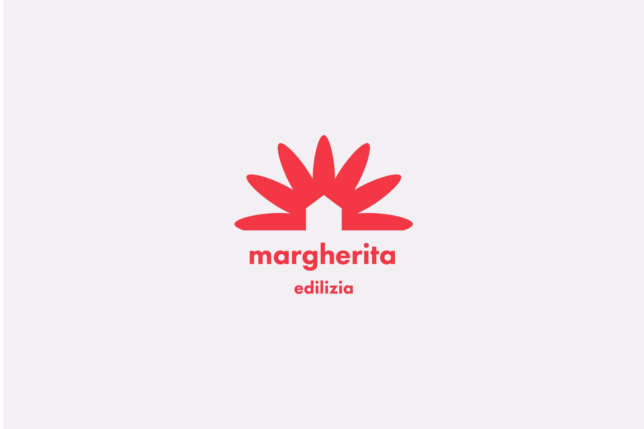
Drawing upon the literal translation of the firm's name 'Daisy' in Italian, the proposal aimed to propel the emblem's style into the 20th century, while retaining a hint of the vintage 'modernism' flair.
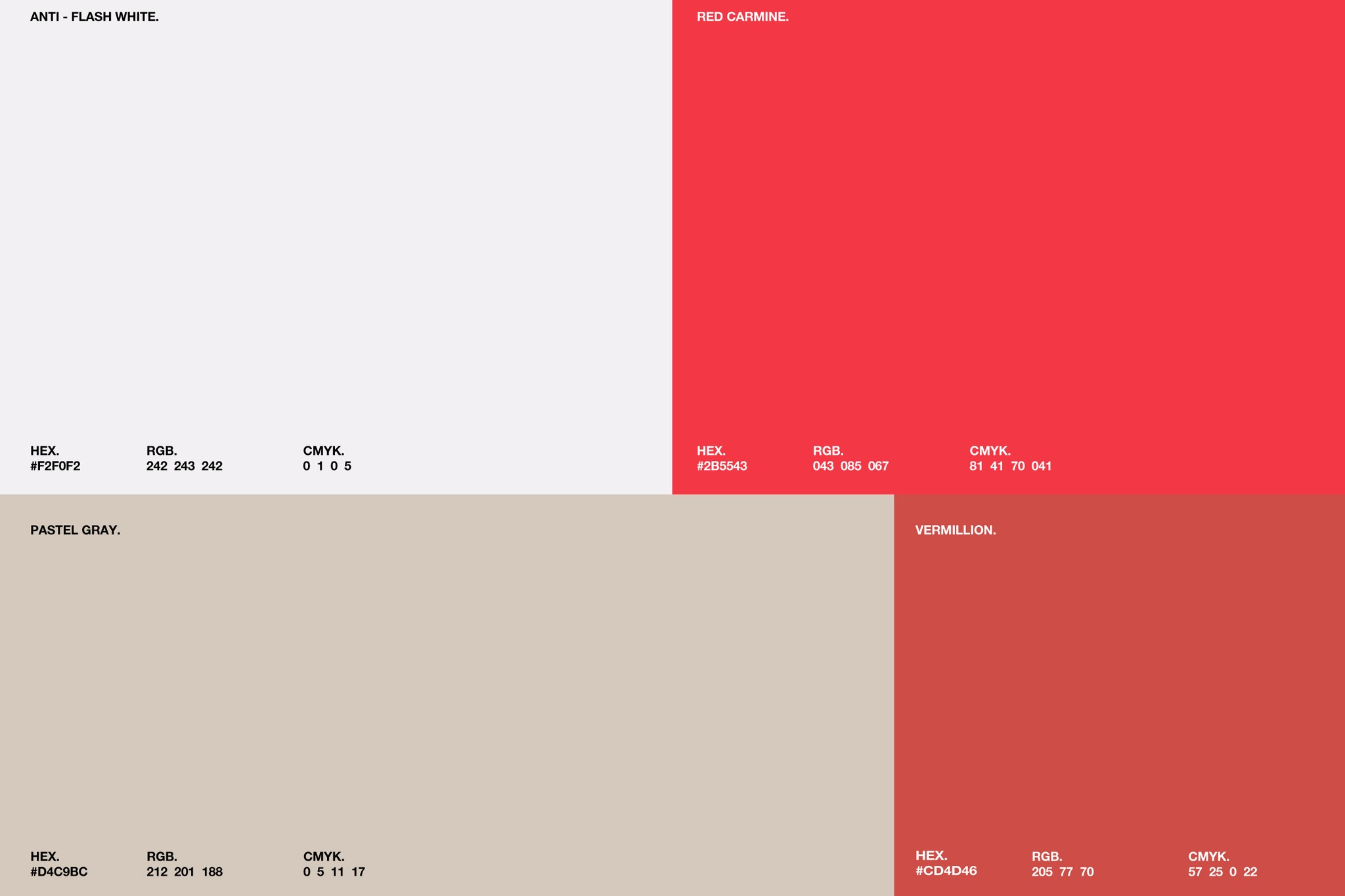
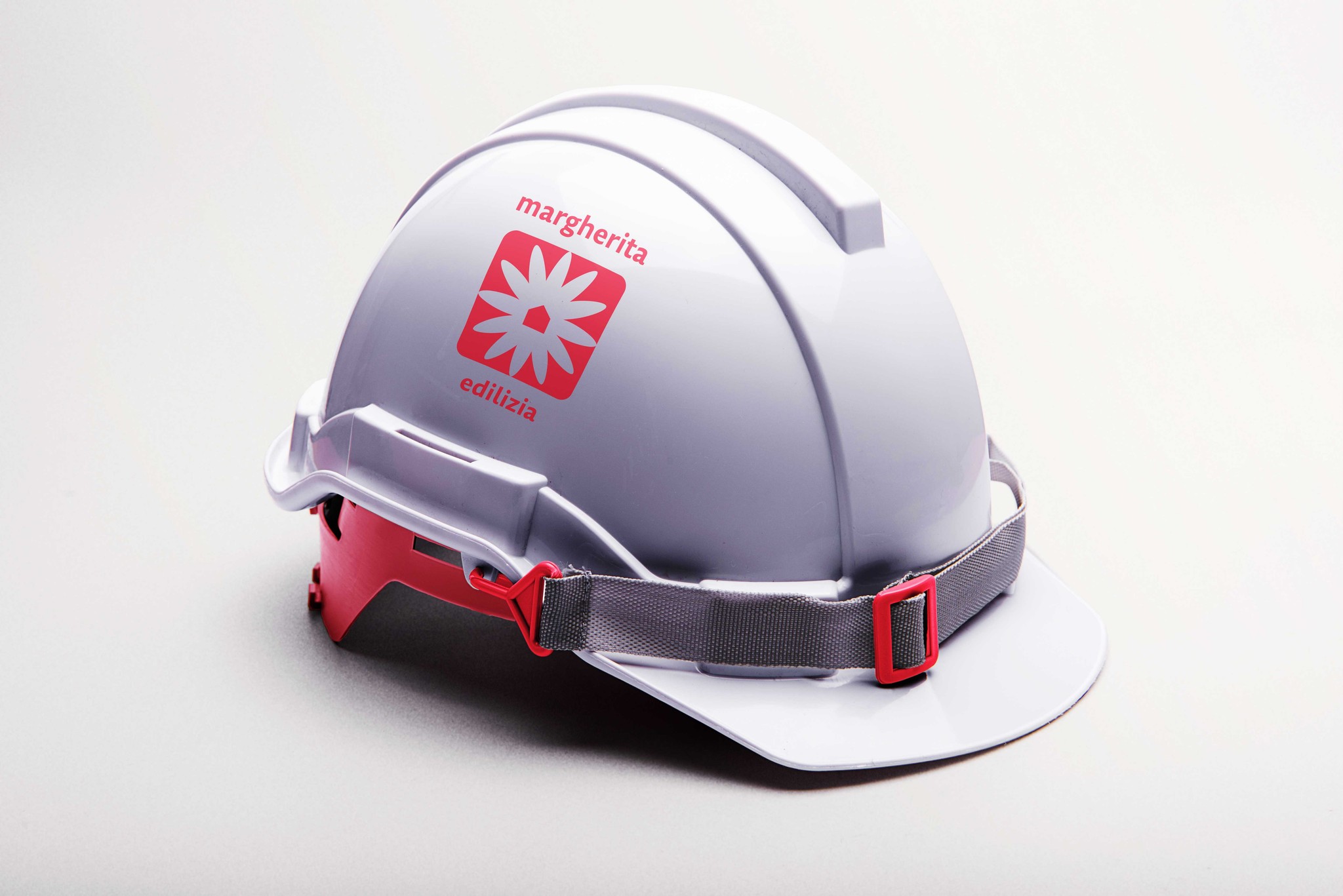
The design of the visual brand symbolizes the firm's principles and aims to stand out in the competitive market. The choice of hues draws inspiration from assorted construction commodities like sand, cement, and stone, further enhanced by a hint of audacious Red Carmine.
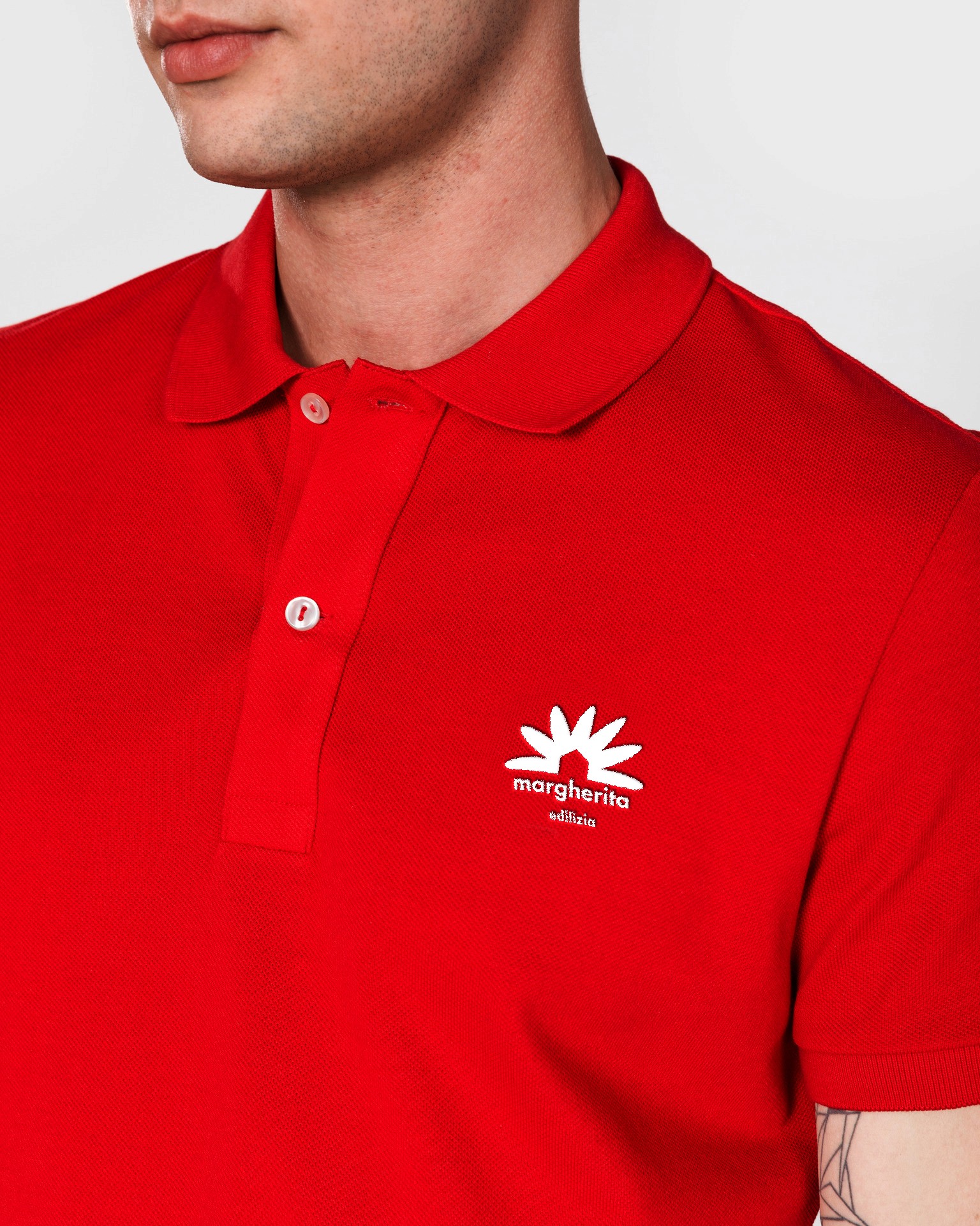
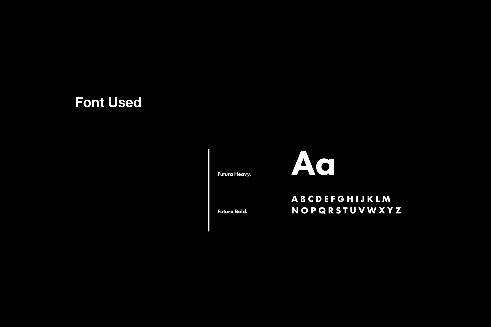
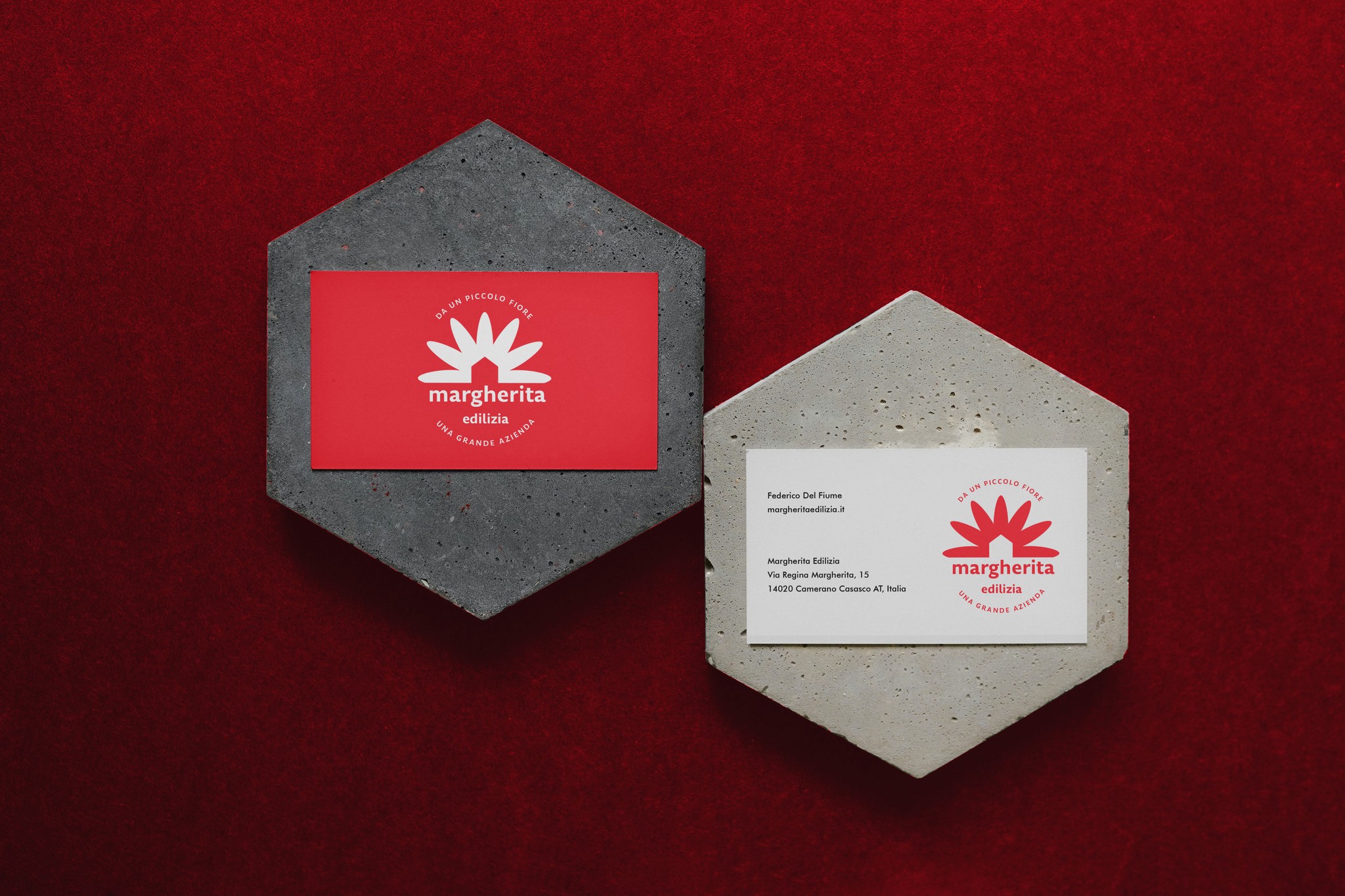
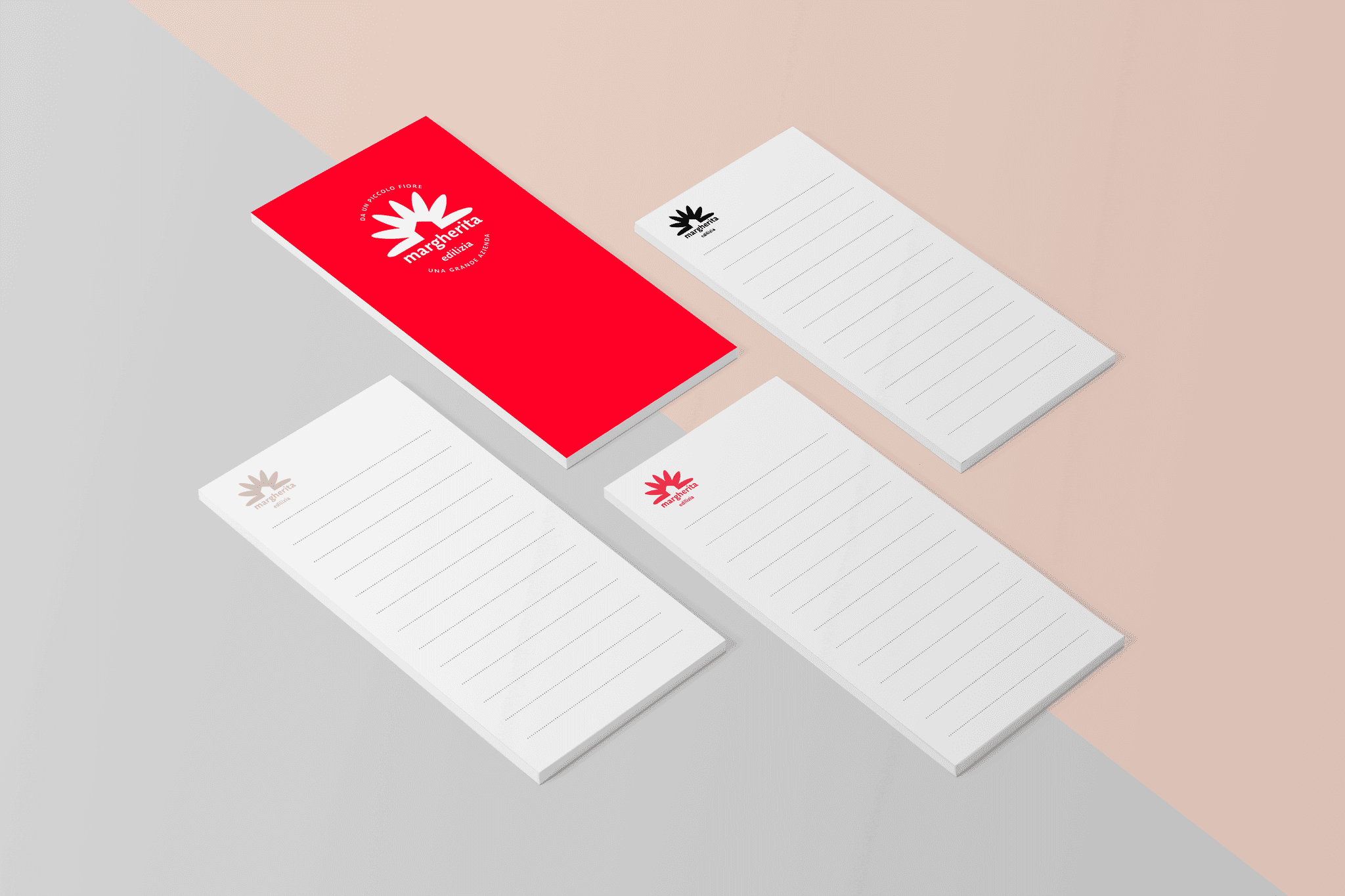
This conjunction with a contemporary font underlines the brand's standing as a market pioneer. The emblem was created to be showcased in all the company’s resources, covering storefronts, wrappers, paper promotions, and online movements.

Contacts
La Margherita
For over 30 years, La Margherita has been a trusted home improvement, construction supply, and garden product merchant. In recent years, the business has experienced a rapid expansion, going from a single store to 14 outlets, effectively covering the length and breadth of the entire region.
Drawing upon the literal translation of the firm's name 'Daisy' in Italian, the proposal aimed to propel the emblem's style into the 20th century, while retaining a hint of the vintage 'modernism' flair.
The design of the visual brand symbolizes the firm's principles and aims to stand out in the competitive market. The choice of hues draws inspiration from assorted construction commodities like sand, cement, and stone, further enhanced by a hint of audacious Red Carmine.
This conjunction with a contemporary font underlines the brand's standing as a market pioneer. The emblem was created to be showcased in all the company’s resources, covering storefronts, wrappers, paper promotions, and online movements.