Davide Carlucci - Gardener
Davide Carlucci is a skilled youthful gardner and landscape artist committed to establishing a solid, aesthetically pleasing persona.
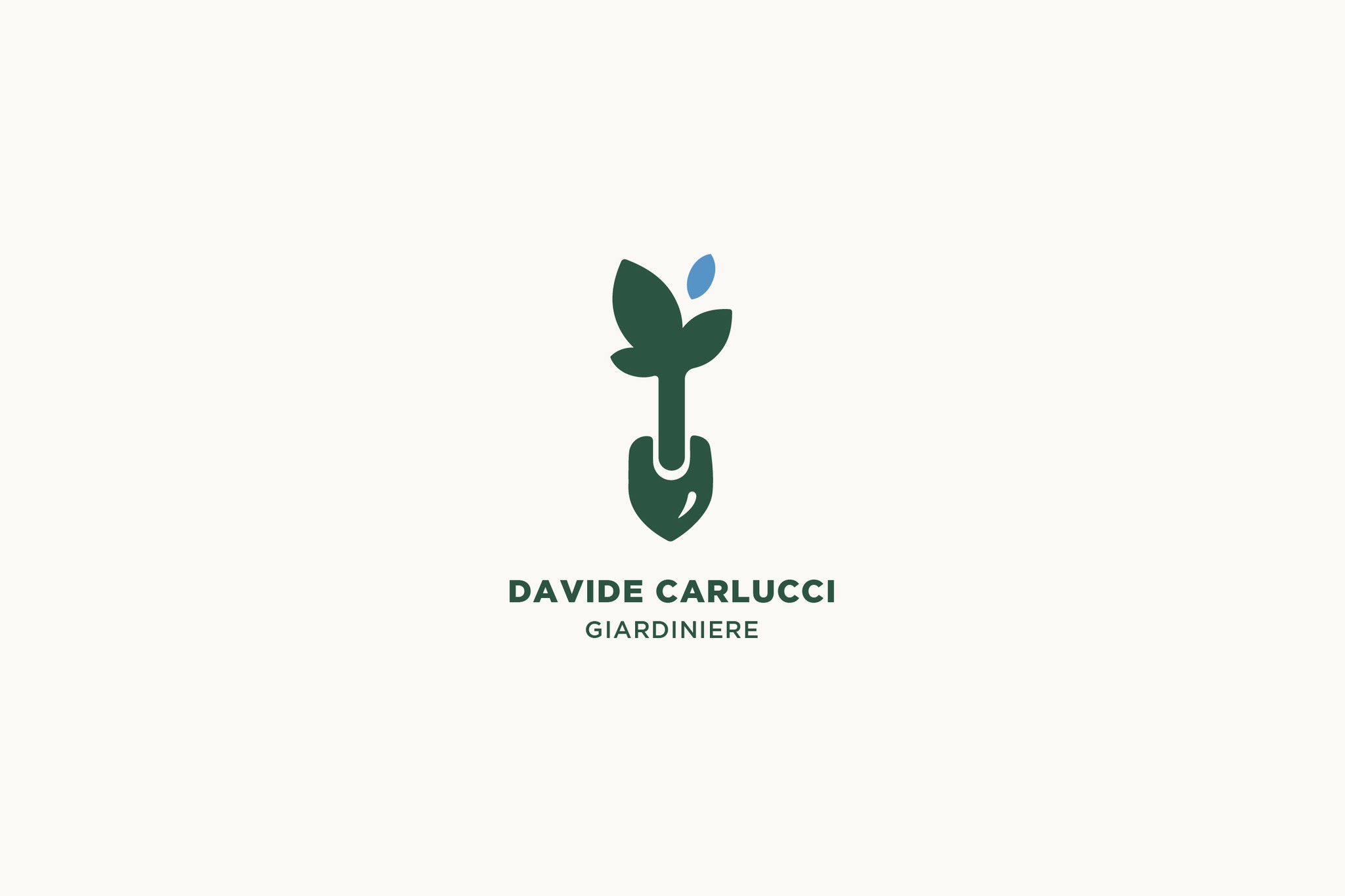
He aimed to cater to a diverse audience, ranging from the youthful to the elderly, hence the requirement of a logo that was simplistic yet minimalist by design, also incorporating a Sans Serif font for legibility and discernibility even at moderate to great lengths.
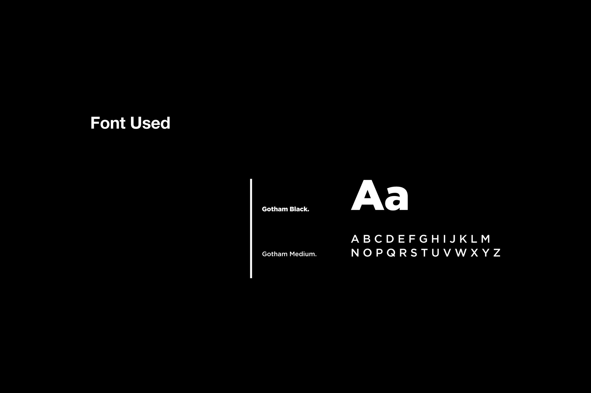
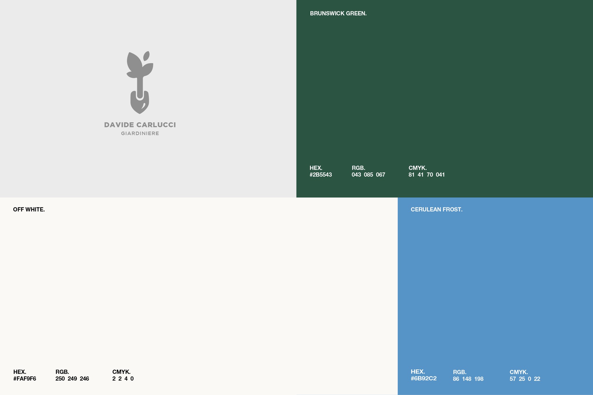
The emblem merges two aspects: a stripped-down, contemporary style and a Sans Serif typeface. The angular figures create a visually appealing logo, readily identified at any range. Besides, the typeface selected for the emblem lets it pop and be readily differentiated, even when observed from a distance.
Contacts
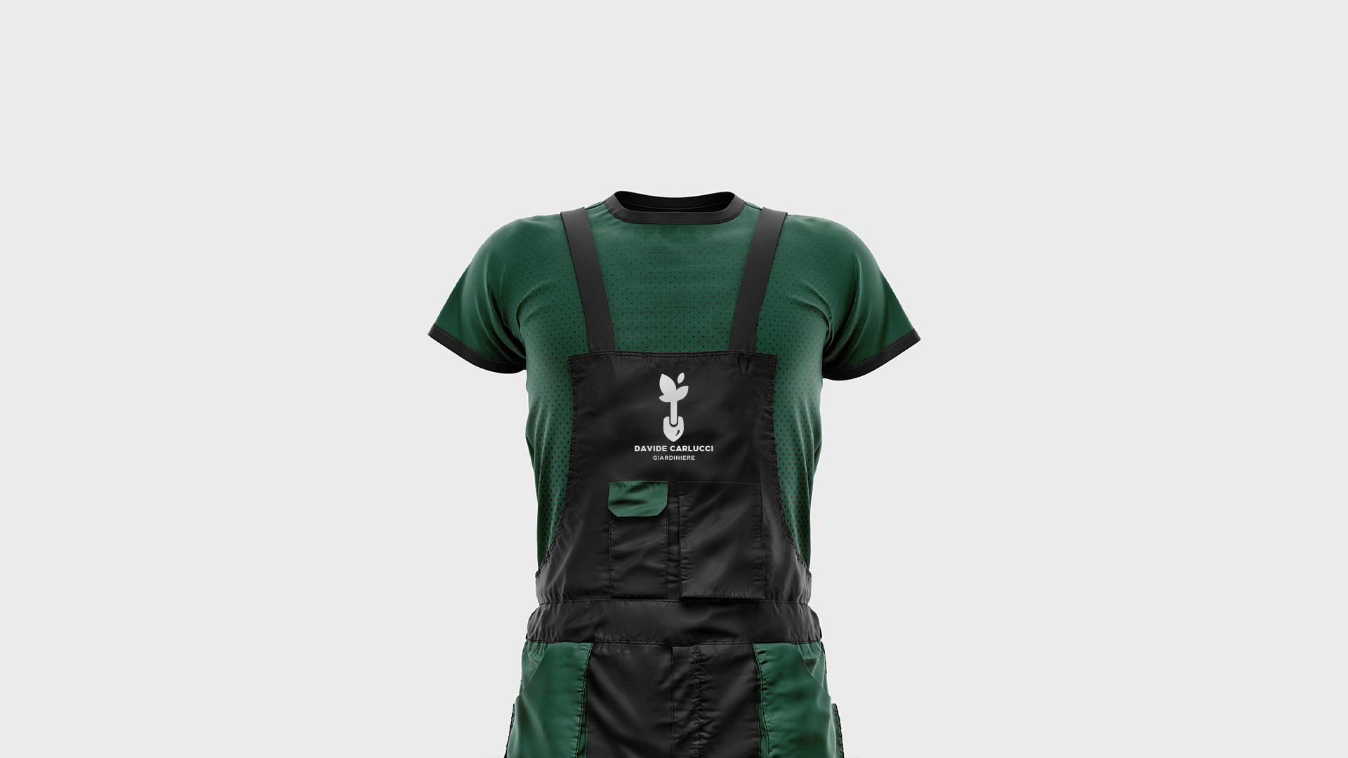
Davide Carlucci - Gardener
Davide Carlucci is a skilled youthful gardner and landscape artist committed to establishing a solid, aesthetically pleasing persona.
He aimed to cater to a diverse audience, ranging from the youthful to the elderly, hence the requirement of a logo that was simplistic yet minimalist by design, also incorporating a Sans Serif font for legibility and discernibility even at moderate to great lengths.
The emblem merges two aspects: a stripped-down, contemporary style and a Sans Serif typeface. The angular figures create a visually appealing logo, readily identified at any range. Besides, the typeface selected for the emblem lets it pop and be readily differentiated, even when observed from a distance.
Contacts
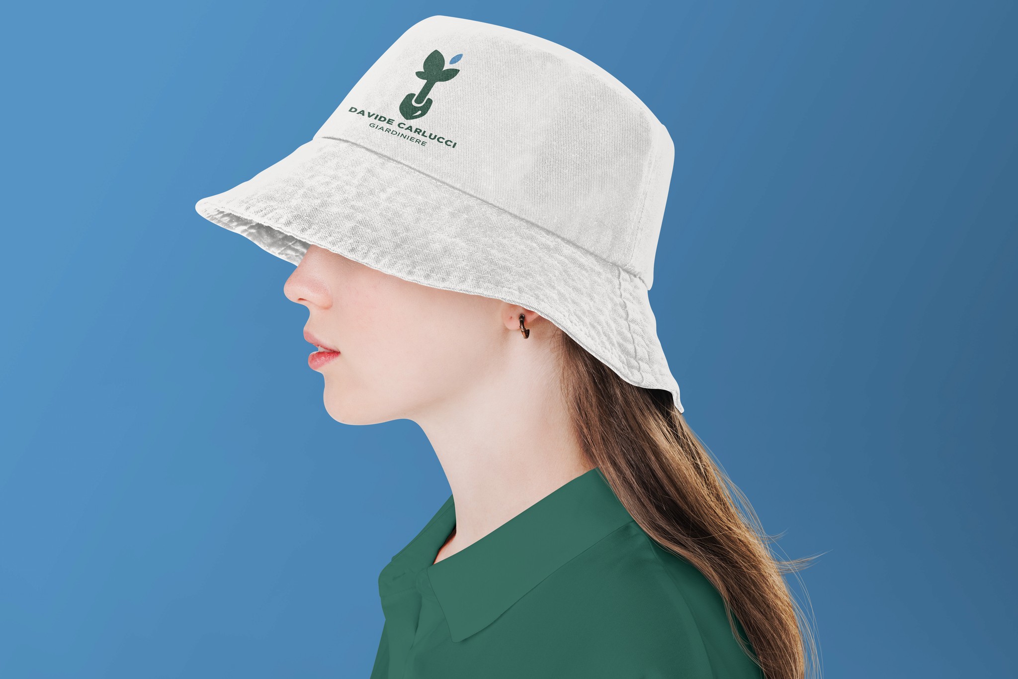
Davide Carlucci - Gardener
Davide Carlucci is a skilled youthful gardner and landscape artist committed to establishing a solid, aesthetically pleasing persona.
He aimed to cater to a diverse audience, ranging from the youthful to the elderly, hence the requirement of a logo that was simplistic yet minimalist by design, also incorporating a Sans Serif font for legibility and discernibility even at moderate to great lengths.
The emblem merges two aspects: a stripped-down, contemporary style and a Sans Serif typeface. The angular figures create a visually appealing logo, readily identified at any range. Besides, the typeface selected for the emblem lets it pop and be readily differentiated, even when observed from a distance.